Navigation
Install the app
How to install the app on iOS
Follow along with the video below to see how to install our site as a web app on your home screen.
Note: This feature may not be available in some browsers.
More options
You are using an out of date browser. It may not display this or other websites correctly.
You should upgrade or use an alternative browser.
You should upgrade or use an alternative browser.
need help deciphering a label
- Thread starter zannew
- Start date
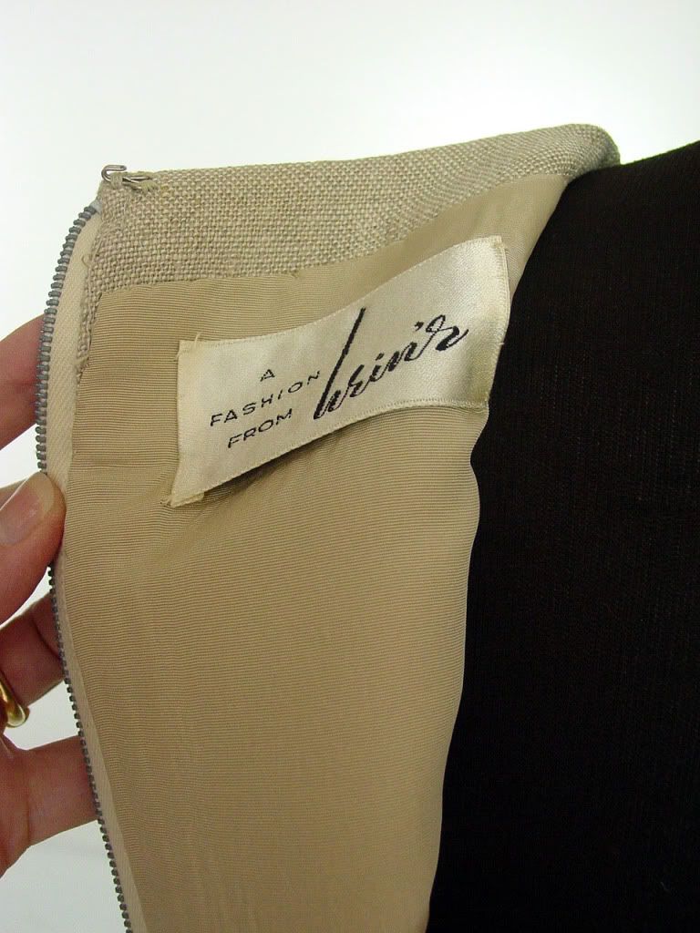
It looks like Wein's to me.
it's not exactly the same, but could be associated somehow maybe...
http://www.weinsonline.com/
there's another Wein's in PA, but no photo. Wein's would be a German name. maybe Austrian heritage, maybe Karin will know.
http://www.weinsonline.com/
there's another Wein's in PA, but no photo. Wein's would be a German name. maybe Austrian heritage, maybe Karin will know.
Catbooks1940s
VFG Member
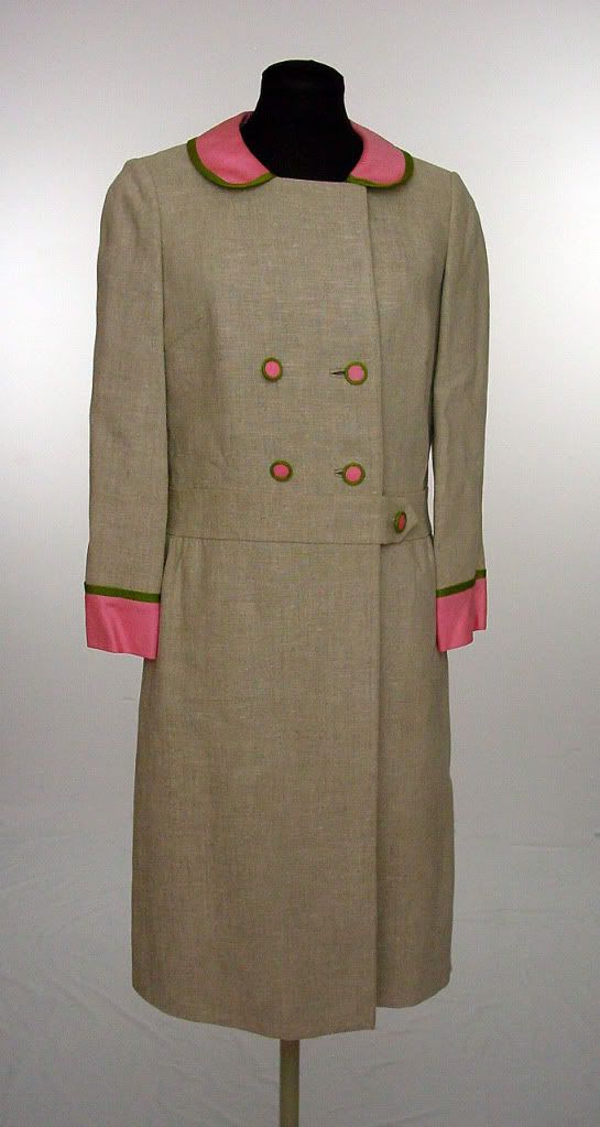
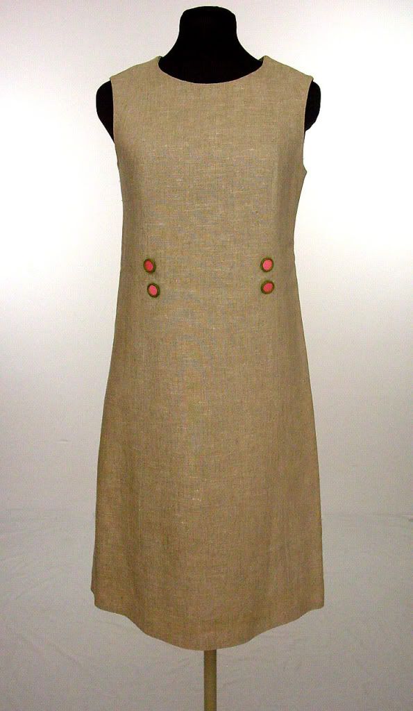
i love this set! it's very, very smart. love the natural linen (i assume linen) with the bright punch of hot pink satin and green piping.
looks to be a store label. could be wein's, but i think hein's. all i could find was a comment in a worthpoint article (comment #7) by someone who'd found a coat with the same label. they thought it said hein's, but that doesn't mean they're right.
http://www.worthpoint.com/blog-entry/persian-lamb-telling-genuine
Pinkcoke
Alumni
The reason I think it is wein's is that the first curve of the w matches the loops joining the other letters, if it were H I would expect exactly the same shape at the bottom as the 'n' going straight up after the first stroke.
Could you perhaps add a photo of the label shown straighter, more face on to the camera?
Could you perhaps add a photo of the label shown straighter, more face on to the camera?
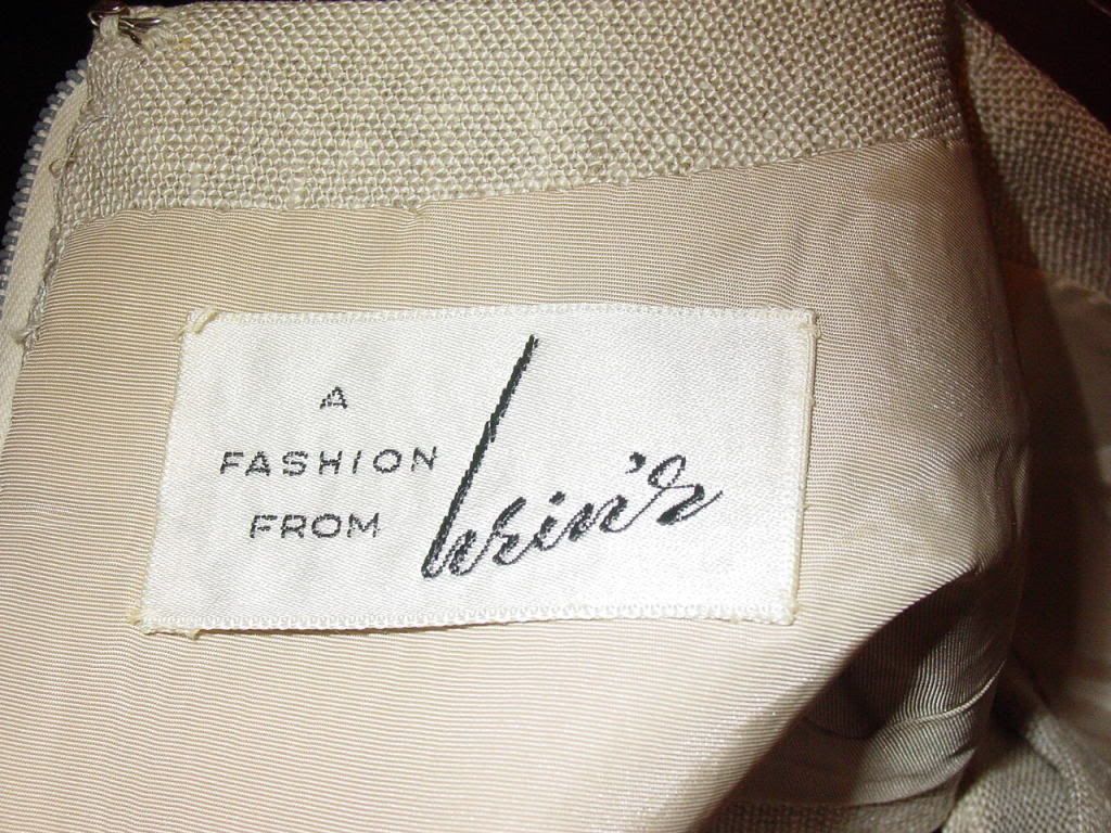
I think it's Hein's. If the first letter were a W, I would expect a different connector between that and the e - a short horizontal stroke, so the W finishes before it runs into the e. There aren't enough strokes for it to be a W, I think. Also comparing the first letter and the n - the way it connects to the next letter is similar, which it would be between an h and n, but not between a w and n, because of the upward last stroke on the w. Also the very tall first stroke makes sense for a lower case h, but not really for a w, even a stylised one.
There is an ebay thread here showing the same label for deciphering, most see Hein's and it being a store label: http://forums.ebay.com/db1/topic/Vintage-Clothing-Accessories/Does-This-Tag/510286089&start=
Here is an article referring to a Hein's department store in Waukegan, Illinois, it began in the early 20th century according to a downloadable doc on the same site http://www.villageprofile.com/illinois/waukegan/02/topic.html
and here Hein's Waukegan is listed in Life 1953 and here in Harpers Bazaar 1967
I've found a few other references to the department store, including one calling it "the elite fashion store in Waukegan", but nothing useful like an ad though, so we could compare the typefaces. But my opinion, FWIW, on the typography, backed up by the existence of store of that name in a similar time period, is now is firmly Hein's.
Ruth
Catbooks1940s
VFG Member
wow, great sleuthing, ruth!
yes, that's why i thought it said hein's too. to be a W, it'd need another upstroke at the end of the letter.
yes, that's why i thought it said hein's too. to be a W, it'd need another upstroke at the end of the letter.
yay well done Lynne, that's the confirmation we needed! I was hoping someone with archive access would be able to find something.
Catbooks1940s
VFG Member
lynne, you're the best! glad to have this one put to rest.
i want to go to that sale!! think it's still in progress? :lol:
i want to go to that sale!! think it's still in progress? :lol:
that should go to the label resource, now that is has been solved. http://forums.vintagefashionguild.org/viewthread.php?tid=66616
") Great resource!
Great resource!